Lost the Plot, Kept the Lines: A Lesson in the Wrong Kind of Faithful
What engineers can steal from mapmakers who lie for a living

We’ve all been in a presentation where someone ludicrously intelligent manages to lose the room’s attention in under a minute. It’s very common amongst academics and professional thinkers.
We all see it as soon as the slide pops up onto the screen – and usually, it’s a chart or a diagram with far too much information on it. Usually, by any technical metrics, it’s probably perfect; every component is there; every interface; every link; every redundant path; every label, all depicted with the same care and attention.
But the room stays silent - not because anyone was impressed, but because noone could find the thing they were referencing or talking about. If we’re lucky, someone else in the room may eventually pluck up the courage to question it and seek a bit more clarity from the presenter; four minutes later, a single piece of data is extracted out of the explosion of information on the slide, and everyone carries on. It’s a perfect example how something can be ‘complete’ or ‘finished’, yet also useless in achieving it’s purpose.
The remarkable thing about this common scenario – often seen in management meetings where the technical staff are attempting to explain findings to C-suite - the failure is rarely a lack of skill. It was actually the opposite - too much of the wrong kind of skill.
We’ve actually had a solution on this type of communication, and it was figured out a long time ago – not by engineers, but by mapmakers.
The man who deleted geography
In 1931, a 29-year-old engineering draughtsman called Harry Beck sat down in his spare time and redrew the London Underground map. London Transport had a perfectly accurate map at the time. It showed the lines where they actually ran, over a real street geography, true to distance and position. It was also a tangled mess, especially in the centre where the stations bunch up, and passengers found it confusing.
Beck threw the geography away. He straightened every line into verticals, horizontals and 45-degree diagonals. He blew up the cramped central zone so you could read it, and he squashed the sprawling suburbs so they’d fit. He kept exactly one piece of real-world geography as an anchor, the River Thames, and threw out the rest. His own explanation was blunt: “If you’re going underground, why do you need to bother about geography? Connections are the thing.”
London Transport initially rejected it for being too radical, but then reluctantly trialled 500 copies in 1933. They printed 850,000 in the first two months. It’s now one of the most recognised pieces of information design on the planet, and it works precisely because of everything Beck refused to draw.
Every map is picking a fight
There’s something which engineers and other technical folk innately tend to resist: a map is never reality. It’s just an argument about what matters, but disguised as a neutral picture.
There’s a useful pair of words for this:
A topographic map is true to the ground: real positions, real distances, real scale.
A topological map is true to the connections: what joins to what, in what order, regardless of where things physically sit.
Beck’s diagram is topologically honest and topographically a lie, and that’s the whole point. He sacrificed where things are to make crystal clear how they connect, because connection is the only thing a passenger underground actually needs.
Strangely enough, nearly every map does a version of this deal – even the ones we think of being very ‘accurate’. The Mercator projection you you’ll have seen since school, takes a round Earth and flattens it so that compass bearings come out as straight lines, which is exactly what a 16th-century sailor needed to plot a course. But the price it pays is area; in some iterations, Greenland can end up looking the size of Africa, when about fourteen Greenlands would fit inside it. But it’s the bargain the map struck to do its one job. Mark Monmonier wrote a whole book called How to Lie with Maps, and the lie isn’t the scandal - the lie is actually the craft.
Engineers usually do the opposite of this on instinct. We treat distortion as failure and completeness as virtue, so we cram everything in and call it accuracy. What we actually produce is the tangled 1931 map. All technically there and complete, but still totally unreadable.
The grown-up word for lying
Cartographers (the professional description for people who draw maps) have a formal name for drawing things wrong on purpose. They call it generalisation, and it’s a real discipline with named techniques, not a vague instinct to tidy up. Five of them map almost directly onto what you do at a whiteboard.
Selection is deciding what goes on the map at all and deleting the rest. For instance, on a network diagram, that’s the courage to leave the monitoring VLAN and the NTP server off the architecture slide because this review is about data flow, not infrastructure plumbing.
Simplification keeps the essential shape and drops the fiddly detail. A coastline becomes a smooth line. Your fourteen-step process becomes one labelled arrow.
Exaggeration makes the important thing bigger than life so it survives at reading size. Roads on a road atlas are drawn far too wide to be true to scale, because a hair-thin true-to-scale road would be invisible. Your critical path deserves the same treatment: a heavier line, a louder colour, more room.
Displacement nudges things off their true position so they stop colliding visually. Beck moved stations to make the diagram breathe. You can move a box two centimetres left so the reader’s eye doesn’t have to fight a crossing.
Classification, or typification, collapses many things into a representative few. Two hundred individual sensors become one block that says “sensor array (x200).” No essential information is lost, but it’s just depicted on a diagram that can be read.
None of this is new to the people who think about charts. Jacques Bertin laid out the visual variables you’ve got to play with back in 1967, position, size, shape, colour, value, orientation, texture; Edward Tufte gave us the data-ink ratio. What the mapmakers added was a proper vocabulary for deliberate deformation. Tufte’s technique mostly wants you to remove clutter. Cartographers will happily bend the truth of where something is, and they’ve got techniques and standards for doing it honestly.
Same system, two maps
So by way of an example: here’s the same plant control architecture drawn twice. Sensors, edge gateways, network, controllers, analytics, operators.
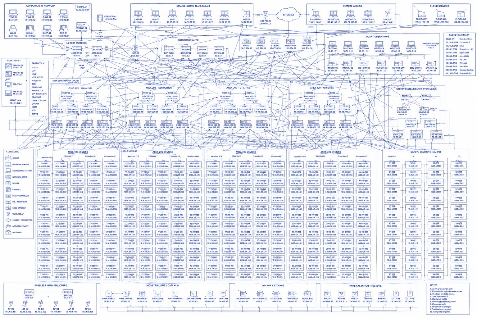
This first version is the one that I talk about in the introduction - the one that appears on the slideshow and loses the room’s attention. You can see every sensor drawn individually, every redundant link, protocol tags, IP addresses, switch model numbers, all lines equal, sprawling across the page in a layout that vaguely follows where the kit physically sits. Complete. Dead.
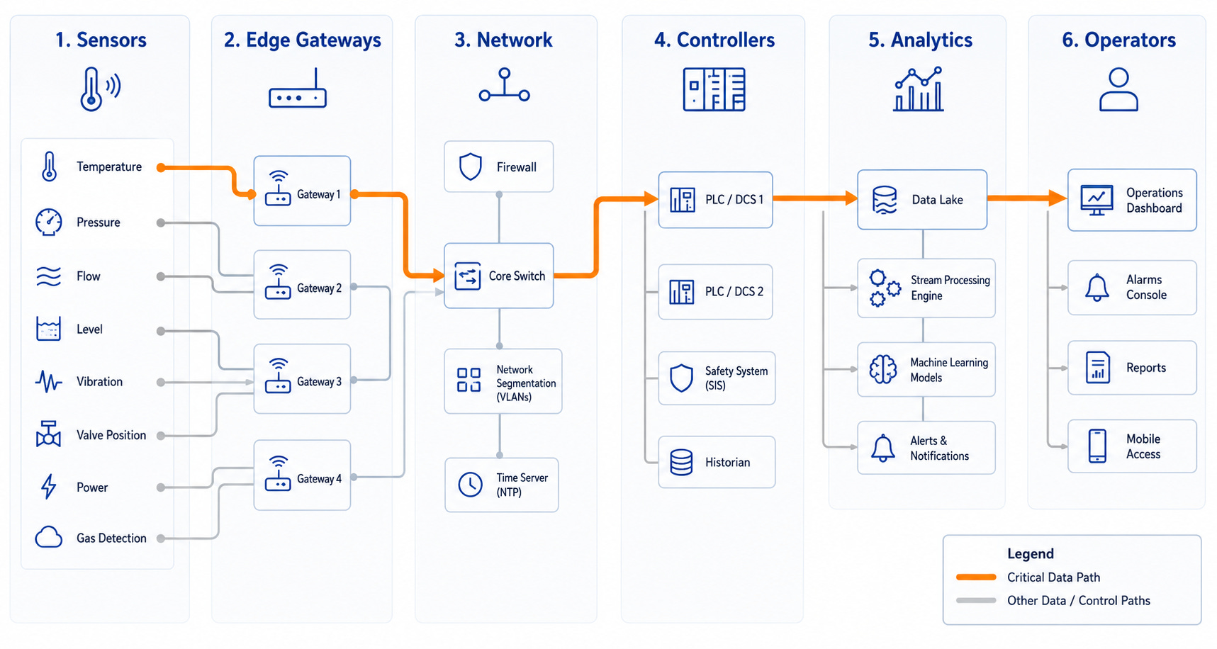
The second version applies the five moves. The sensors are classified into typified blocks. The flow runs cleanly left to right similar to Beck’s straight lines. The critical path and the one real bottleneck are exaggerated so your eye lands on them first. The IP addresses and switch models are selected straight off the page. The only way to improve this would be a note the corner saying what this drawing is for and what it deliberately leaves out.
In both examples, it’s the same system - but you can only really think clearly with one of them.
Declare your projection
That note that I should have put in the corner is not insignificant, and it’s actually the difference between a useful lie and a dangerous one.
Every serious map states its scale, its projection and its date. That declaration is what makes the distortion honest, because it tells you the rules for reading it and, by implication, what not to use it for. Nobody walks into the River Thames because the Tube map drew the embankment wrong, because nobody thinks the Tube map is to scale. But where the Tube map does mislead people is the bit it doesn’t declare; for instance, Leicester Square to Covent Garden looks like a journey. In reality, it’s one stop on the Piccadilly line, and about 250 metres on foot. People ride it every day because the map’s silence about distance lets them. The distortion that makes the network legible but obfuscates from the fact that the walk is arguably faster than going through the barriers, down the escalators, waiting for the train, and then back up following your less-than-a-minute journey.
That’s the crux of this - a good, simplified diagram tells you it’s simplified, but a bad one pretends to be complete. The solution is almost insultingly simple: write on the drawing what kind of map it is and what you took out. Modern iterations of Tube maps now put a little note next to Leicester Square informing that it’s just a 10 minute walk to Covent Graden.
Where the distortion kills
There’s a bit of nuance that need to apply to this argument though. Distortion is a skill when the job is to help someone understand, and what you cut isn’t needed for the decision they’ll make. It becomes negligence when the job is to help someone act, build it, operate it, certify it, respond to a fault, and you cut something they needed to act safely. A nautical chart and a road atlas of the same coast are both heavily distorted, and neither is more accurate in the abstract. Attemptiong to navigate the rocks with the road atlas and you’ll find you’re on them.
So the two worlds need to be kept apart:
The released fabrication drawing, the P&ID of record, the FMEA, the certified schematic, those are your survey maps. They live under ASME, ISA and IEC standards, under revision control and sign-off, exactly because people build and certify from them and a dropped tolerance there can kill. You do not generalise those.
Everything in this article belongs to the other layer, the diagrams you draw to explain: the review slide, the architecture overview, the onboarding sketch, the briefing for the stakeholder who needs the shape of the system and not the means to fabricate it.
Get that distinction wrong in one specific way and there is a scenario where it could be lethal, but I do think that’s quite a rare occurrence, and most humans are aware of the distinction. The sin isn’t simplifying; it’s letting a drawing made to explain get mistaken for the record people act on, with no note on it to say which one it is. A good map always tells you what kind of map it is, and thhe bad ones let you assume they’re the whole truth.
Harry Beck knew his map was a lie, and that’s why it’s one of the most useful drawings ever made. His skill worth borrowing isn’t necessarily drawing less accurately; it’s knowing exactly which map you’re making, and adjusting it for your purpose – but just ensure you never let anyone confuse it for the other type.
TH
You may find these of interest:
How Just-in-Case has replaced Just-in-Time in manufacturing

Toyota gave the world just-in-time manufacturing, and for the best part of forty years it was treated as gospel. Hold as little stock as you possibly can, let the supply chain feed you the exact part, at the exact moment, on the exact day you need it. Inventory sitting on a shelf was seen as dead money, a sign of sloppiness, should always be optimised r…
The drug dichotomy creating the inevitable climb of biocrimes

It’s been 5 years since peak-COVID, and the dust has largely settled for most. Throughout and following the global pandemic, there was always hints of speculation that the virus was synthesized - and it’s release was even planned.
Bleeding Out

Since I turned 18, four times a year I find myself sat in a local town hall or church. A few questions before a needle is stuck into my arm, and 1 pint of fresh blood is drawn. Usually within a day or two, I receive a text telling me where my donated blood has ended up.